
Perfume Bottle Decoration Methods | Coating, Screen Printing, Hot Stamping
For most perfume bottles, choosing the decoration method is not complicated: use coating when the bottle needs a large area of color or a different surface finish, screen printing for logos and text, and hot stamping for reflective gold, silver, or other metallic details. A clear bottle with one black logo may need only 1 process. A matte bottle with white text and a reflective gold logo may need 3 processes: coating, screen printing, and hot stamping.
What matters is whether the decoration works on the actual bottle. Bottle shape, print area, color coverage, adhesion, fragrance contact, and rubbing inside the packaging all need to be checked before mass production.
Choose the Process by the Result You Need
| Required Result | Process to Check First | Main Production Risk |
|---|---|---|
| Full or partial bottle color | Coating | Uneven coverage, scratches, weak adhesion |
| Matte or gloss surface | Coating | Rub marks, gloss variation, surface defects |
| Logo, fragrance name, or simple graphic | Screen printing | Weak opacity, broken fine details, poor alignment |
| Reflective gold or silver logo | Hot stamping | Missing foil, rough edges, poor transfer |
| Detailed multi-color artwork | Compare screen printing and digital printing | Color alignment, number of print stages |
| Small artwork on a difficult curve | Review the position first; compare pad printing if needed | Limited contact area, distorted artwork |
There is no need to add another process just to make the bottle look more complex. Every extra step means another setup, another material layer to control, and another place where defects can appear.
Use Coating When Most of the Bottle Needs Color or Texture
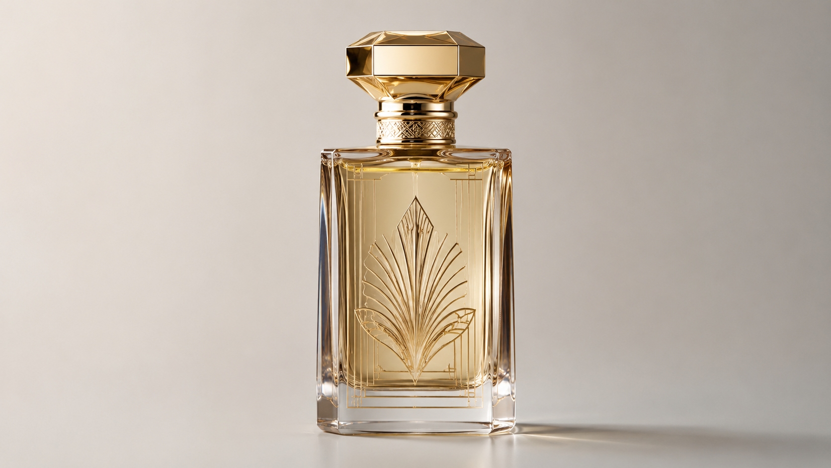
Coating works well for opaque colors, transparent colors, matte surfaces, gloss finishes, soft-touch finishes, metallic effects, gradients, and partial color areas.
Before approving a coated bottle, confirm at least 5 things:
- the exact color;
- whether the finish is matte, gloss, transparent, opaque, or another effect;
- which parts of the bottle need coating;
- which parts need to stay clear;
- whether printing or foil will be added afterwards.
Simply asking for a “matte black bottle” is not enough. The black can look right from the front while the shoulder has weak coverage, the bottom edge looks uneven, or the later print does not stick well to the coating.
Check These Areas on an Opaque Coated Bottle
Do not inspect only the center of the bottle. Check at least 4 areas:
- the main front panel;
- the shoulder;
- the bottom radius;
- recesses or areas where the bottle shape changes sharply.
Spray coverage can be slightly different in these areas. A bottle may look fully black from the front but show a thinner color around the shoulder or lower edge.
If the design includes a clear window or an uncoated section, look closely at the edge between the two areas. An uneven masking line can make the bottle look poorly finished even when the main coating color is correct.
Check Transparent and Gradient Bottles Empty and Filled
Transparent decoration should be checked in 2 conditions: empty and filled.
The final look can change because of:
- coating thickness;
- glass thickness;
- fragrance color;
- lighting.
A thick glass base often looks darker than the side wall, even when the coating itself is even. Once the fragrance is filled, the liquid color can change the bottle again.
For a gradient bottle, check these 5 points:
- where the fade starts;
- where it ends;
- whether the transition looks smooth;
- whether several bottles look similar side by side;
- whether filling changes the final color.
If the gradient needs to line up with a logo or printed line, the position matters more. A simple background fade can usually allow more variation.
Trace Matte and Gloss Damage Back to the Contact Point
Matte bottles can develop fingerprints, rubbing marks, shiny patches, or polished areas after repeated contact. Gloss bottles usually show fine scratches more easily.
If several bottles have damage in the same place, check these 4 sources first:
- carton inserts;
- caps or collars;
- production fixtures;
- packing and transport contact.
Do not change the coating straight away. If a sharp insert keeps rubbing the same position, a harder coating may still end up scratched.
Use Screen Printing for Logos, Names, and Solid Graphics
Screen printing is commonly used for brand names, fragrance names, volume information, logos, borders, lines, and simple graphics.
Glass bottles can be printed with different ink systems, including organic, ceramic, and UV-curing inks. They do not all cure in the same way or work equally well on every surface.
For a screen-printed bottle, check:
- where the artwork is printed;
- the smallest text and lines;
- how well the ink covers the background;
- whether different colors line up;
- whether the print stays attached to the actual glass or coating.
Move Artwork Away From Difficult Bottle Areas
These 6 areas usually make printing harder:
- strong shoulders;
- deep curves;
- sharp corners;
- recessed areas;
- raised glass details;
- irregular sculptural surfaces.
A bottle may have a large visible front, but that does not mean the whole area is easy to print. The surface often starts to curve before the visible panel ends.
If a logo sits too close to a shoulder or corner, moving it slightly may solve the problem without changing the printing method.
XUELEI's OEM/ODM fragrance manufacturing service covers bottle design, prototyping, packaging, and production review, so the decoration area can be checked before the artwork is finalized.
Simplify Details That Are Too Small to Print Cleanly
Small text and detailed logos commonly run into 4 problems:
- thin lines break;
- small openings fill in;
- fine gaps disappear;
- letter edges become rough.
There is no one minimum line width that works for every perfume bottle. It depends on the ink, screen, equipment, artwork, and bottle shape.
Reversed text also needs care. Small clear letters cut out of a large printed block can close up more easily than the same letters printed as solid ink.
If tiny details are barely visible on the finished bottle anyway, simplifying them usually gives a cleaner result than trying to force every original detail into a very small print area.
Check White Ink for Coverage, Not Just Color
White or pale ink can look gray on black, dark blue, amber, or green bottles if too much of the background shows through.
Check 2 things when approving the print:
- whether the white is the correct shade;
- whether it covers the background well enough.
A white print can have the right color and still look weak because the ink coverage is too low.
Avoid Unnecessary Multi-Color Alignment
A design with 2 colors that need to meet at exactly the same edge can be harder to produce than 3 separate colors that never touch.
Alignment is more difficult when:
- one color sits inside another;
- two borders need to meet;
- fine lines overlap;
- printing has to line up exactly with foil.
If two graphic elements do not really need to touch, leaving a small planned gap can make small production shifts much less noticeable.
Use Labels When Direct Printing Adds Unnecessary Complexity
Screen printing gives the bottle a clean look because there is no label edge, but labels can be the more practical choice when there are:
- small first orders;
- many SKUs;
- frequent text changes;
- graphics that are easier to produce on a printed label.
Digital printing can also work well for some detailed multi-color graphics. Pad printing may suit small areas that normal screen printing cannot reach comfortably.
Use Hot Stamping Only When Reflection Matters
Hot stamping is mainly used for a bright, reflective metallic effect.
Common finishes include:
- gold;
- silver;
- rose gold;
- bronze;
- colored metallic foil;
- holographic effects.
If the logo only needs to look gold and strong reflection is not important, metallic printing may already be enough. There is no reason to add hot stamping if it does not noticeably improve the finished design.
Approve Foil on the Actual Bottle Surface
Gold can look very different depending on the selected foil. Champagne gold, yellow gold, rose gold, and bronze-gold are not the same.
The background changes the look as well. The same foil can appear different on:
- clear glass;
- gloss white;
- matte black.
A foil sample card is useful for narrowing down the choice, but the final decision should be made on the real bottle finish.
Hot stamping on glass is also more than simply pressing foil onto untreated glass. Depending on the process, the bottle may need a prepared surface, coating, underlayer, or another suitable transfer system.
Check These 6 Hot-Stamping Defects
- missing foil;
- small holes;
- broken edges;
- rough corners;
- incomplete lettering;
- foil outside the intended graphic.
If the same part of the same letter keeps failing, check the artwork position, bottle curve, and local surface.
If missing foil appears randomly in different places, the problem is more likely to come from the overall process rather than one specific part of the artwork.
Treat Coating, Printing, and Foil as One System
A bottle using all three methods has 3 main decoration stages:
- coating;
- screen printing;
- hot stamping.
In production, this may become about 7 working steps:
- prepare the glass surface;
- apply the coating;
- cure the coating;
- screen print the artwork;
- cure the print;
- apply the foil;
- inspect the finished bottle.
The exact sequence depends on the materials being used. In simple terms:
glass → optional coating or surface treatment → printing and/or foil
If the coating is changed, the print or foil may need to be checked again. Changing one layer can affect how the next layer sticks to it.
Match the Decoration to the Bottle Shape
| Bottle Shape | Works Well For | Common Problem |
|---|---|---|
| Flat | Centered logos, large text, foil details | The edges may start curving before the visible front panel ends |
| Cylindrical | Rotational screen printing | Wide artwork may wrap too far around the bottle |
| Square | Front and rear panel decoration | Artwork crossing corners is harder to control |
| Irregular | Small selected decoration areas | Less usable space and more difficult positioning |
Find the Weak Layer When Decoration Peels
Peeling problems can usually be divided into 4 situations:
- Coating comes off the glass: check cleaning, surface preparation, curing, and the coating itself.
- Printing comes off the coating: check the ink and whether it works with that coating.
- Foil comes off its base: check the foil system and the surface underneath it.
- Several layers come off together: the real weak point may be lower down in the decoration stack.
Cross-cut testing is one recognized way to check how well a coating system resists separation. ISO 2409:2020 allows the test to be used for classification or pass/fail assessment and for checking separation between coating layers. It does not directly measure adhesion force.[1]
Test Fragrance Contact Where It Actually Happens
Perfume can reach the outside of the bottle during filling, pump fitting, leakage, spraying, or daily use.
After contact with the fragrance, check for these 6 changes:
- softening;
- loss of gloss;
- staining;
- stickiness;
- print damage;
- foil damage.
Pay particular attention to the neck and shoulder, because those areas are more likely to come into contact with the liquid.
If fragrance compatibility needs to be checked, use the actual fragrance or a suitable representative formula. Water alone cannot show how an alcohol-based perfume will affect the decoration.
Different perfume formulas may behave differently, so passing one fragrance test does not automatically mean every SKU using the same bottle will give the same result.
Test the Bottle Inside Its Real Packaging
A decorated bottle can rub against at least 6 common parts during production and shipping:
- paperboard inserts;
- plastic trays;
- caps;
- collars;
- production guides;
- transport packaging.
This rubbing can cause scratches, worn printing, foil damage, color transfer, or shiny spots on a matte coating.
Testing the bottle alone is not enough. Assemble the real cap, collar, insert, and carton and check how the parts touch each other.
Approve Color With a Physical Bottle
Do not use a computer rendering as the final color standard.
A physical reference bottle should confirm at least 5 points:
- color;
- opacity;
- gloss or matte level;
- transparency where needed;
- the overall look on the actual bottle.
Compare several bottles together. A small color difference that is hard to notice on one bottle can become obvious when several are placed side by side.
Use This Defect Table During Sampling
| Defect | Check First |
|---|---|
| Uneven coating | Shoulders, edges, recesses, and changes in bottle shape |
| Particles in coating | Glass cleanliness, handling, and fixture contact |
| Orange-peel surface | Compare it with the approved bottle under normal inspection lighting |
| Weak white printing | Check whether the dark background is showing through |
| Broken fine lines | Check whether the artwork is too detailed at the final print size |
| Poor color alignment | Check whether the colors really need to meet at exactly the same edge |
| Missing foil | Check whether the same part of the artwork keeps failing |
| Scratches | Find the cap, insert, fixture, or packaging part touching that area |
Use an 8-Step Test Before Mass Production
- Allow the decoration to complete its required curing process.
- Keep untreated bottles as control samples.
- Record the starting color, gloss, position, print coverage, and foil coverage.
- Run the agreed coating, print, and foil adhesion checks.
- Run rubbing or abrasion checks.
- Use fragrance exposure where outside contact is realistic.
- Assemble the actual cap, collar, insert, and carton.
- Compare the tested bottles with the original control samples.
Set the pass/fail rules before testing starts. Phrases such as “good adhesion,” “minor scratch,” or “acceptable color” are too vague if nobody has agreed what they mean.
FDA does not set one mandatory test program for every cosmetic product or ingredient. Manufacturers and distributors are responsible for making sure marketed cosmetics are safe under their intended or usual conditions of use.[2]
Use 4 Approval Stages Before the Full Run
- Artwork approval: confirm the size, decoration area, color, and foil position.
- Decorated sample: check the actual coating, printing, and foil.
- Filled and packed sample: check liquid color, cap fit, rubbing, and package contact.
- Pilot or production-representative run: check whether the approved appearance can be repeated.
When reviewing the physical sample, check at least 5 visible points:
- color;
- opacity;
- logo position;
- surface finish;
- decoration coverage.
Keep one approved bottle as the reference for mass production.
The same approach is used through the wider XUELEI perfume manufacturing process, where the bottle, filling, assembly, packaging, and quality checks need to work together.
Split the Quote Into at Least 7 Cost Lines
- glass bottle;
- coating;
- screen printing;
- hot stamping;
- tooling or setup;
- inspection;
- protective packing.
Color matching, masking, special fixtures, and additional sorting may also be charged separately.
| Bottle Design | Main Decoration Processes | Main Checks |
|---|---|---|
| Clear bottle + black logo | 1 | Print position, opacity, adhesion |
| Matte bottle + white logo | 2 | Coating consistency, print coverage, adhesion between layers |
| Matte bottle + white text + reflective gold logo | 3 | Coating, print alignment, foil transfer, layer compatibility |
Hot stamping is not always more expensive than screen printing. A small, simple foil logo may be easier to produce than a complex multi-color print that needs very tight alignment.
Separate Bottle MOQ From Decoration MOQ
Before placing an order, confirm these 7 items:
- bottle MOQ;
- coating MOQ;
- screen-printing MOQ;
- hot-stamping MOQ;
- color-specific MOQ;
- sample charges;
- tooling or setup charges.
Decoration has its own setup work. Being able to buy a small number of bottles does not mean every decoration method will make sense at the same quantity.
One larger order using the same decoration is usually easier to manage than splitting the same total quantity across many colors and artworks.
Send These 10 Items Before Asking for a Quote
- the exact bottle or technical drawing;
- expected order quantity;
- number of SKUs;
- vector artwork;
- decoration area;
- color reference;
- required surface finish;
- all decoration processes planned for the bottle;
- target sales market;
- target production or launch timing.
Also send secondary packaging information and representative fragrance samples if rubbing or fragrance compatibility needs to be tested.
This information can be handled as part of XUELEI's OEM/ODM fragrance development process, where bottle, packaging, artwork, filling, and production requirements are reviewed together.
Get Clear Answers to These 7 Supplier Questions
- Can this exact bottle shape be decorated reliably?
- What part of the bottle is safe to decorate?
- Can the smallest logo details be repeated in normal production?
- How will color and print coverage be approved?
- How will multiple print colors or foil be aligned?
- What test method and pass/fail rule will be used?
- What visible defects are acceptable?
Check the Contact Route Before Reviewing Compliance Documents
Materials that directly touch the fragrance need more attention than decoration placed only on the outside of the bottle.
Direct-contact parts can include:
- the inside surface of the bottle;
- pump parts;
- dip tubes;
- seals;
- gaskets.
Under Regulation (EC) No 1223/2009, cosmetic products placed on the EU market must meet the applicable safety requirements, including preparation of a Cosmetic Product Safety Report before being placed on the market.[3]
European Commission guidance also states that packaging materials in direct contact with the formula should be considered because interaction, barrier properties, and migration can affect product safety.[4]
An exterior gold logo should not automatically be treated the same way as material inside the bottle. What matters is whether the material can actually contact the fragrance.
Supplier documents should make these 6 points clear:
- which exact material or decoration system the document covers;
- which color or finish it applies to, where relevant;
- which test or requirement was used;
- whether it covers external use or direct product contact;
- which market it applies to;
- whether a material change means the documents need to be reviewed again.
Statements such as “FDA certified bottle,” “EU approved ink,” or “100% non-toxic coating” are too broad on their own because they do not say what was actually tested.
In the United States, MoCRA requires the responsible person for a cosmetic product to ensure and maintain records supporting adequate substantiation of safety.[5]
Check Environmental Claims on the Finished Decorated Pack
A recyclable glass bottle does not automatically mean the finished decorated perfume package has the same recycling claim.
Check these 4 points:
- which coating system is used;
- how much of the bottle is decorated;
- whether the recycling information covers plain glass or the finished decorated bottle;
- whether changing the coating or foil changes the basis of the claim.
A water-based coating alone does not prove that the complete perfume package is recyclable.
For products sold in the EU, Regulation (EU) 2025/40 on packaging and packaging waste entered into force on 11 February 2025 and generally applies from 12 August 2026.[6]
Use This Final Selection Table
| Design Requirement | Likely Process Count | Best Starting Point |
|---|---|---|
| Clear bottle + black logo | 1 | Screen printing |
| Fully matte colored bottle | 1 | Coating or suitable surface treatment |
| Matte bottle + white name | 2 | Coating + screen printing |
| Matte bottle + white text + reflective gold logo | 3 | Coating + screen printing + hot stamping |
| Transparent colored bottle | 1 main color process | Compare transparent coating and colored glass |
| Detailed multi-color artwork | Depends on artwork | Compare screen printing and digital printing |
| Small logo on a difficult curve | Depends on position | Move the artwork first, then compare printing methods |
| Gold color without strong reflection | 1 | Compare metallic printing and hot stamping |